distributedsystem/books/systemperformance
Core Idea
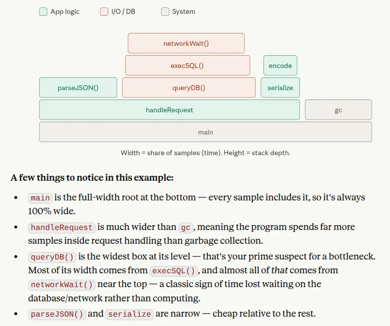
A flame graph turns profiler samples into a picture where width means time: the widest frame at any level is the biggest CPU time sink.
- A profiler samples the call stack many times a second (“what is running, and who called it”); the flame graph aggregates thousands of those samples into one image.
- Y axis is call stack depth. X axis is cumulative sample volume, not chronological time.
- Reading it: a wide plateau is a leaf burning CPU (syscall, tight loop); a tall narrow tower is a deep call chain that costs little. Differential flame graphs highlight frames that grew or shrank between profiles, and icicle graphs are the same thing flipped.
A profiler samples your program’s call stack many times per second (e.g., 99 times/sec). Each sample captures “what function is running right now, and what called it, and what called that,” all the way down to the root. After collecting thousands of samples, the flame graph aggregates them into a single picture.
- The Vertical Axis (): Represents the call stack depth (functions calling other sub-functions).
- The Horizontal Axis (): Does not represent chronological time linearly. Instead, it displays the cumulative volume of samples spent in that specific code path. The wider a function's block spans, the more execution time it consumes.
So the widest frames at any given level are your biggest time sinks. A tall, narrow “tower” means a deep call chain that doesn’t consume much time. A short, wide plateau means a function (often a leaf, like a syscall or a tight loop) that’s eating a lot of CPU directly.
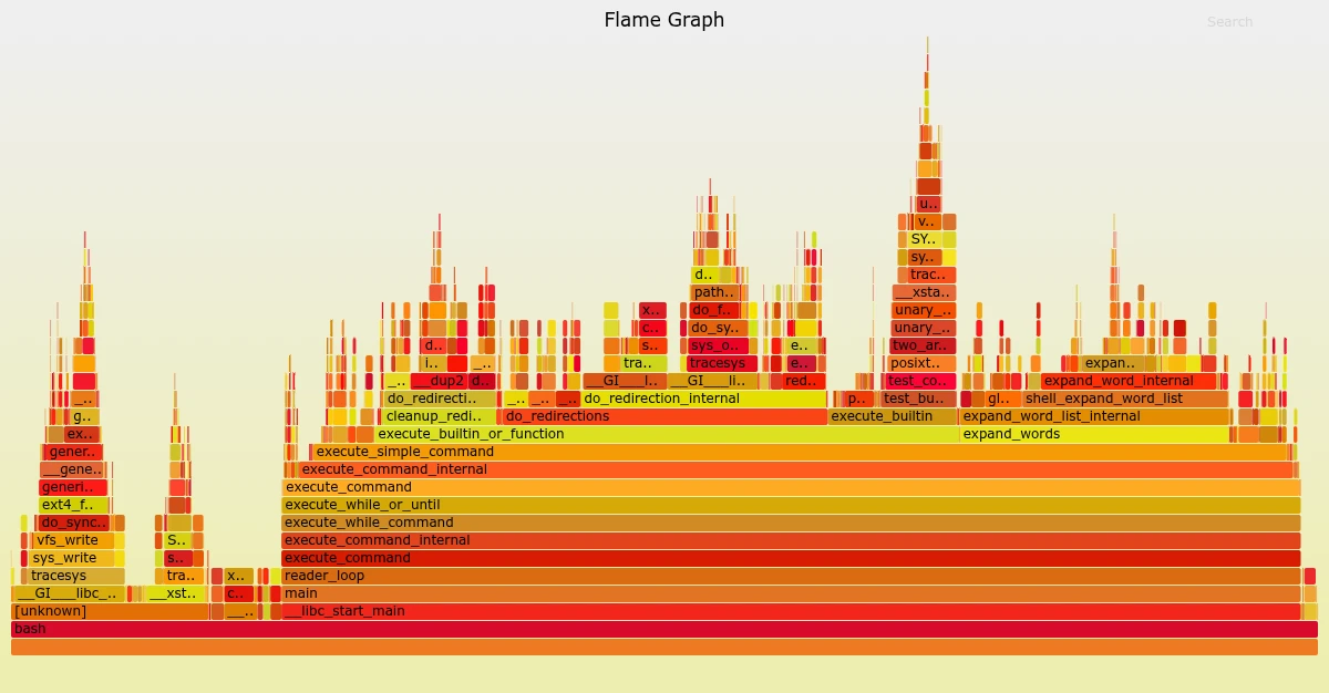
Without a flame graph, a profiler just gives you a long list of functions and percentages, which hides who called whom. The flame graph lets you spot, in one glance, the tallest towers (deep call chains) and widest plateaus (real time sinks) — and clicking down into a wide frame tells you exactly which child is responsible.
- Tools like
pprof,py-spy,perf+ FlameGraph (Brendan Gregg’s original Perl scripts),speedscope, and most modern observability platforms (Datadog, Grafana Pyroscope) can generate these directly from profiling data. - A variant called a “differential flame graph” colors frames by whether they grew or shrank between two profiles — useful for regression hunting.
- If you ever see an “icicle graph,” it’s the same idea upside down (root at top, growing downward) — common in some browser/dev tools.